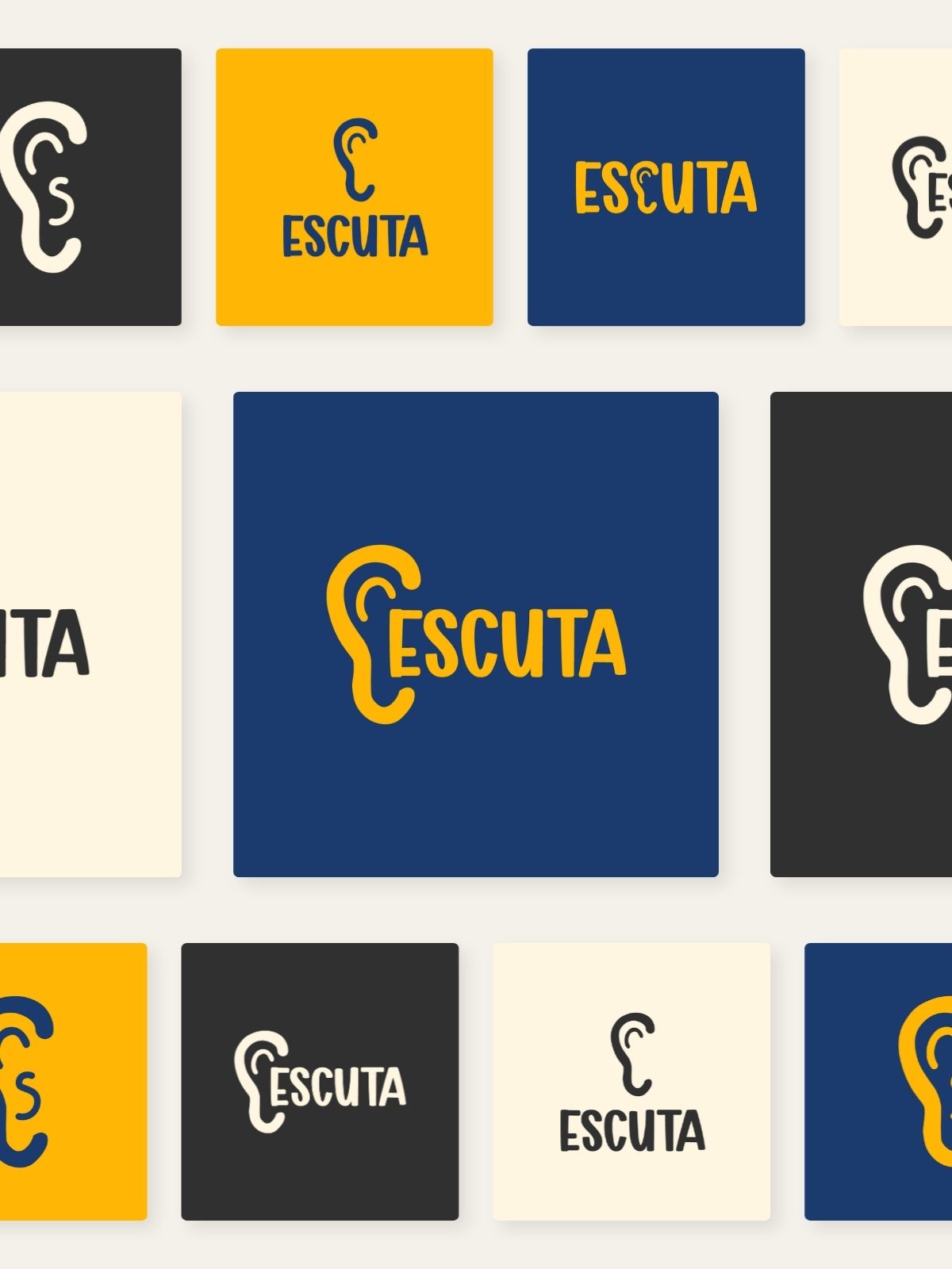
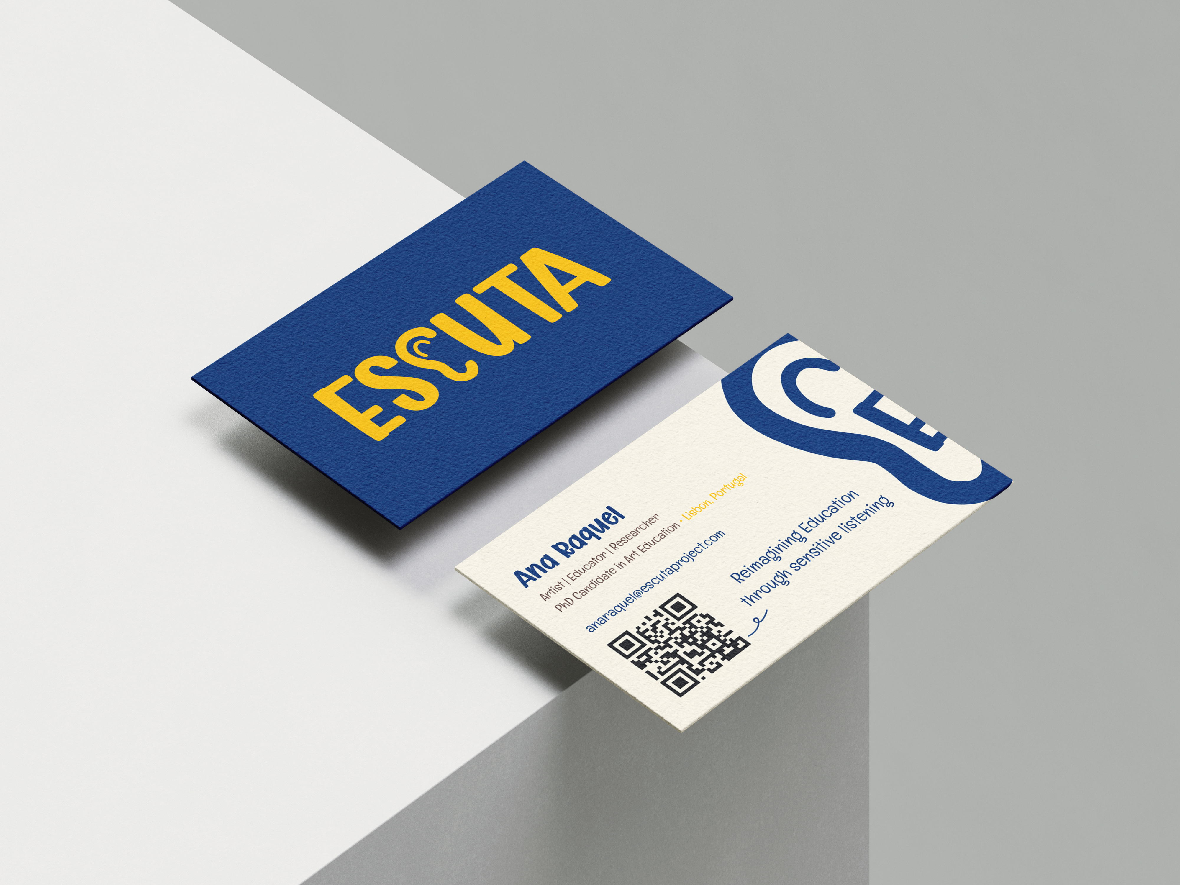
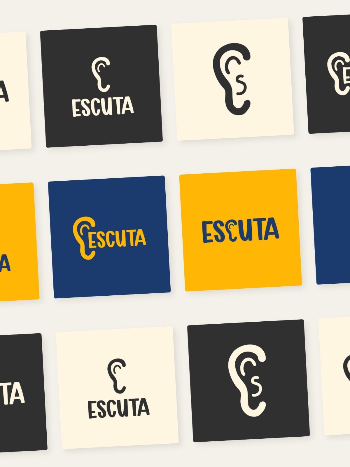
Visual identity redesign for Ana Raquel Ferreira Martins' doctoral research project, which weaves together research, artistic creation and education. From the previous bright cobalt blue and canary yellow, we desaturated the palette and rebuilt the symbol — a stylised ear that merges with the letter "C" of ESCUTA, bringing symbol and word together in a single gesture. A deep navy, a restrained mustard yellow and raw paper hold a more contemplative, editorial, grown-up kind of listening — without losing warmth. The identity extends to the bilingual website, transition cards for the World Conference on Music Education, and the dossier for the performance-workshop.